Building Better Dungeons
Building Dungeons
So in our pursuit to take the Jam game to a full feature game we have decided to focus first on the setting. The environment where you play. Whilst the dungeons are essentially a backdrop to the card battles they still need to be interesting and in some ways have a setting story they tell.
Our first challenge was building 3D environments that look good but also don’t clash with the 2D monster drawings. Bringing them both into a visual style and world.
We would like to get something off our chest first. We (the two of us) do not have strong 3D modeling skills and as the setting is a backdrop to the game we have decided to use bought geometry but are redoing all textures and tweaking the occasional geometry too. This and a lot of shader and lighting work to bring the setting in line with hand drawn.
Making the 3D and 2D work together.
So in order to make the 3D work well with the 2D a few choices have helped. Firstly we keep the directional lighting effect low in order to emphasize the textures rather then the models. This leads to a problem where the edges of models textures can often clash with a texture behind due to colors being so similar and lighting not being a strong visual marker. To overcome this issue we approached it as you would in a 2D drawing. We have added a subtle outline that makes the shapes more clear without forcing the whole scene into a much stronger lighting as well as suitable darkening patches to areas that merge.
The screen shots we sharing show partially completed set (just the dungeons, other environments are planned) so some of the textures are still being reworked to come more in line with the art style we are trying to implement.
Outlines and lighting how they help.
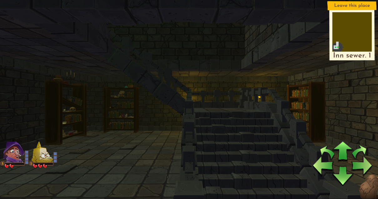 So the above image is a staircase leading up for the screen shot we turned the outlines and the lighting off. It’s visible but there is a lot of similar colors with not clean break between them. While the shapes are readable it’s tiering for the eyes over time and doesn’t really pop out enough.
 This is the same shot with the outline turned on. It’s soft enough that it doesn’t pull the eye to it but still frames the shape. This helps a lot on edges where the shape ends but it doesn’t do much to make the inner shape edges show up nor does it help when an object intersects another. To solve that we have added a strong Ambient Occlusion.
 Above is the Ambient Occlusion turned on but the outlines are off. It helps pop the shape out a lot but still leaves the edges sometimes a little harder to discern then we would like.
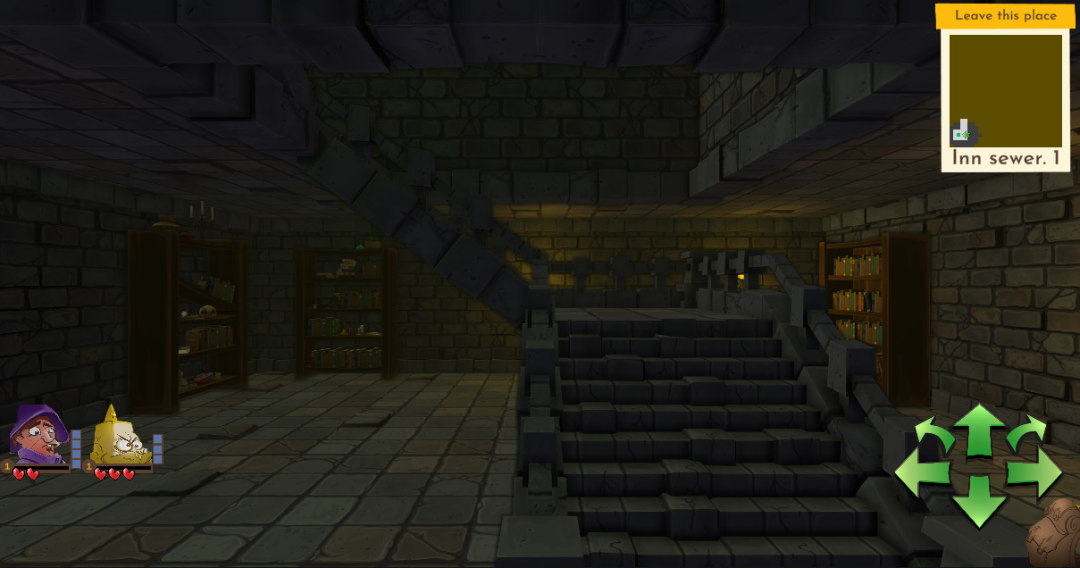 So this is with both turned on. This now matches our desired 2D style and is more visible. We could still bring the shapes and color into view stronger but the dungeon is still a backdrop for the game and we want the monsters to really pop.
Keeping the monsters and 3D working together.
So we are still planning to animate the mobs so there may be a few changes to how they look but below are two screen shots showing a Rat in scene. We happy for now the visual style is matching between the 3D and 2D but will continue to work on it. One gap we are well aware of is the mob shadows are absolutely awful :(.
NOTE: If you are an animator that knows Spine please get in touch we looking for someone to do the animations in the game.
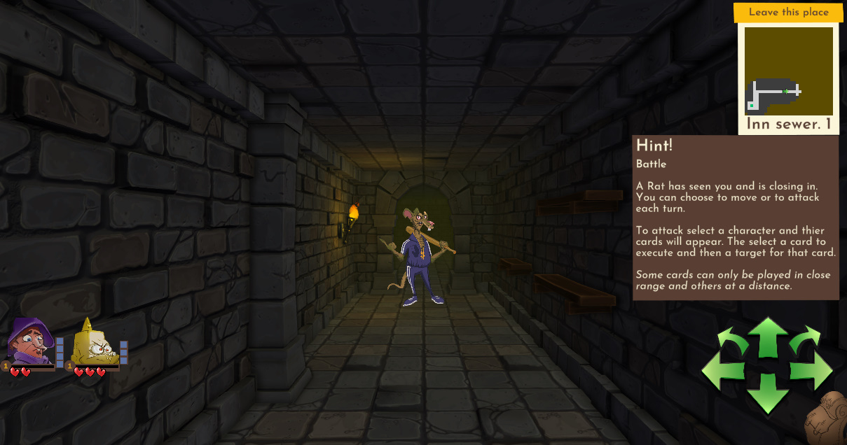 Rat at distance.
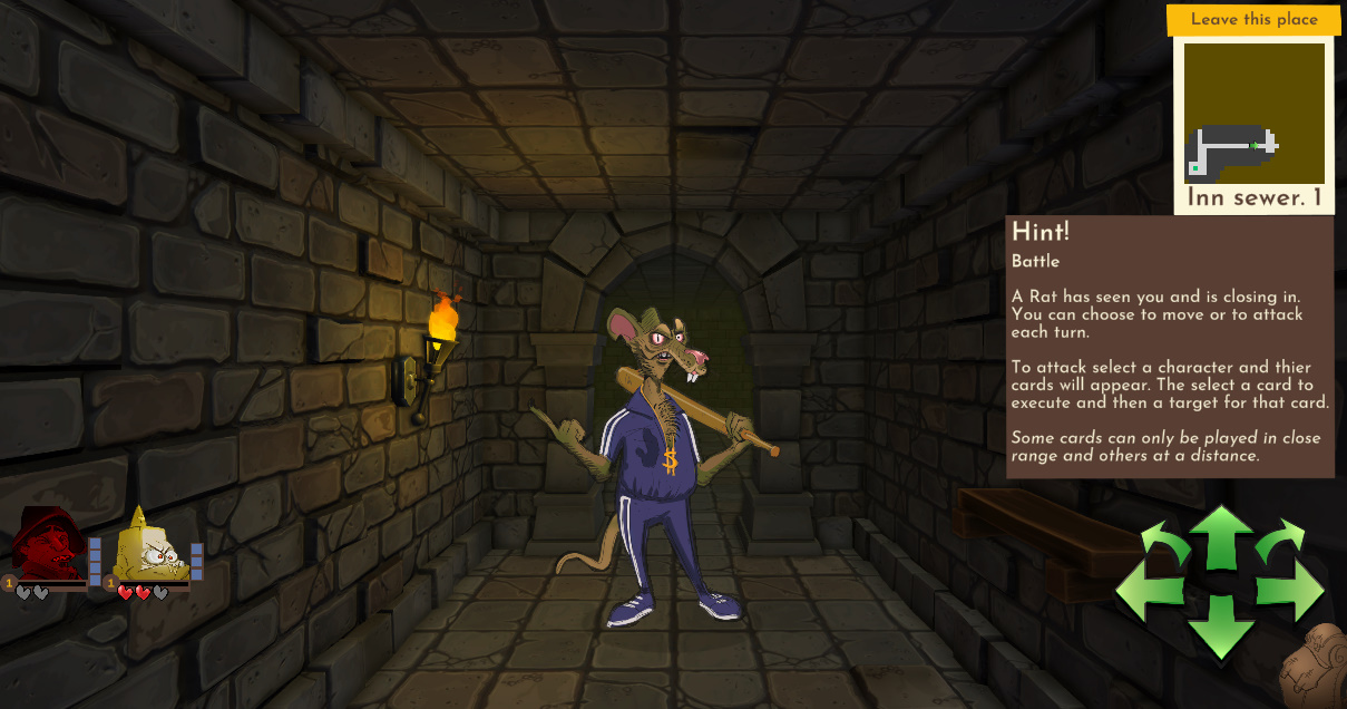 Rat once he has moved closer. Similar outline but stronger values to make it pop out the scene without exceeding a threshold where it would appear to be stuck on.
Negative space
The dungeon generator is building positive areas and corridors next step we will be adding blocked tiles and negative spaces to make the levels more interesting.
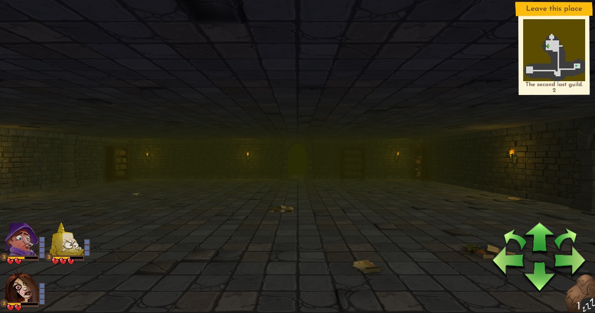 If you consider this image from a large library room it’s clear some negative space will make the area more interesting, both visually and to navigate and battle in. That space can be filled with book shelves or study tables or a small dais with a book stand on top and so on. We are also considering holes in the floor and other approaches for some rooms.
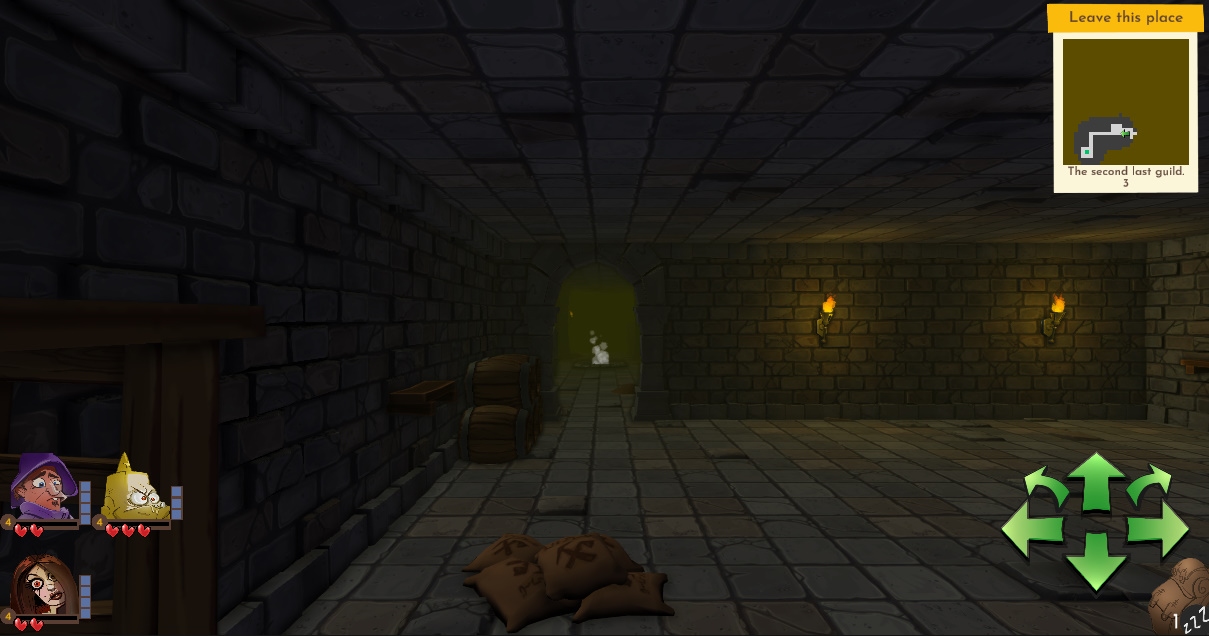
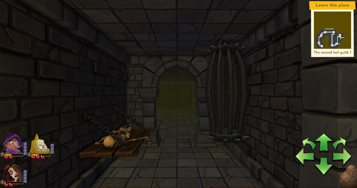
Bunch of screen shots
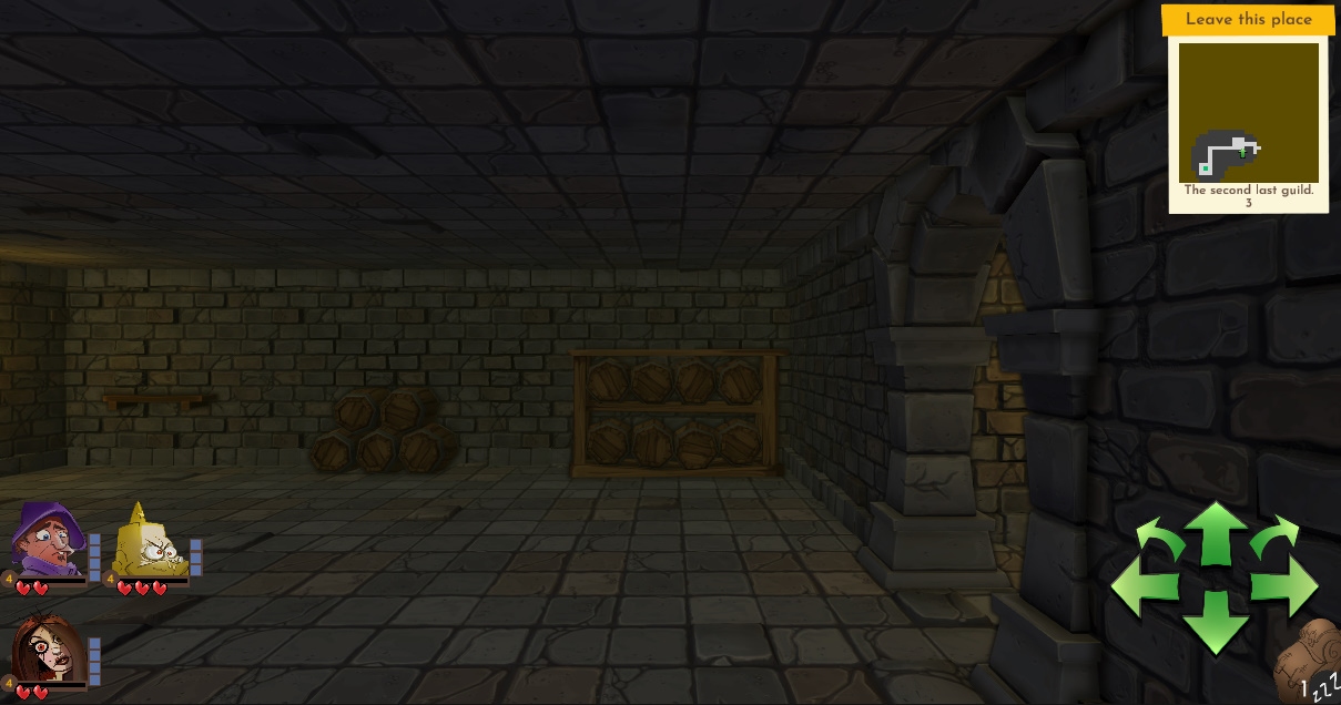
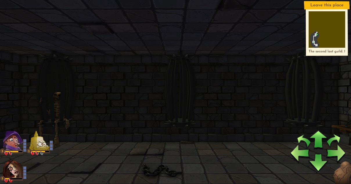
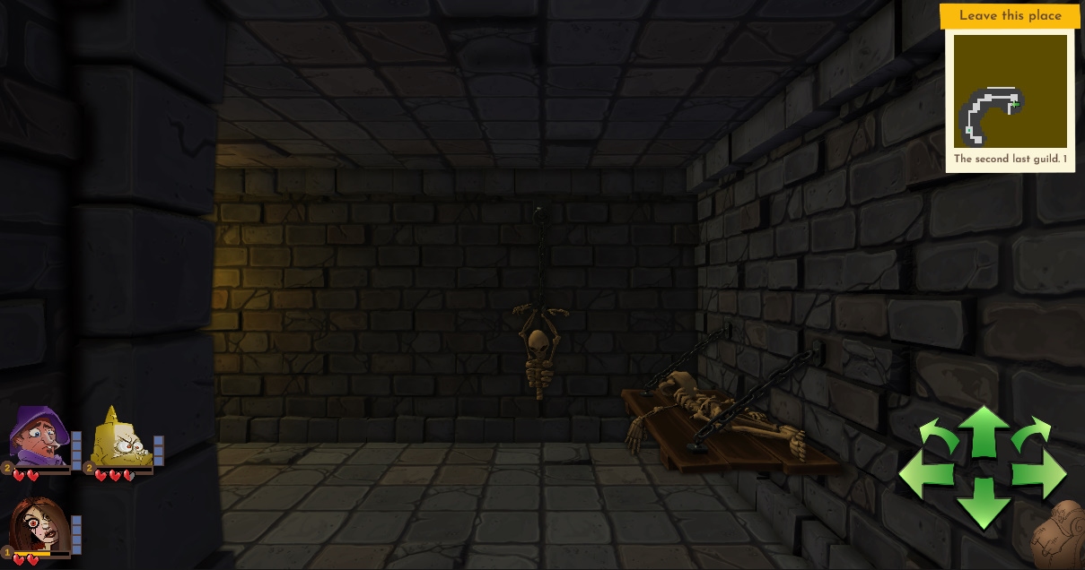
Here are a few other screen shots from a dungeon. We still planning to bring in more types of rooms and more variations for the ones here but we happy with the progress so far.
Get Dumbest Dungeon
Dumbest Dungeon
A dungeon crawling card battler with a sense of humor where game balance should be.
| Status | Released |
| Author | Inkus Games |
| Genre | Role Playing, Card Game |
| Tags | Comedy, Creepy, Cute, Dungeon Crawler, Funny, linux, macos |
| Languages | English |
More posts
- Considering Tactics rather than First PersonFeb 20, 2024
- Card GFX DesignJun 04, 2022
- UI ProgressMay 28, 2022
- Linux and Mac builds.May 01, 2022
- Jam Version Fixes and Polish completed.Apr 30, 2022
- Week 2Apr 23, 2022
- Day 7 (last day)Apr 15, 2022
- Day 6 of the JamApr 14, 2022
- Day 5 of the JamApr 13, 2022

Leave a comment
Log in with itch.io to leave a comment.