UI Progress
We have made some adjustments to the UI
So a card game is very largely a huge UI undertaking (as we are learning ;) ). Most of the game happens in the UI after all. We still have a long way to go but you know how you eat an elephant. One pixel at a time of course.
Stuff that moves
For those that just like moving things we got you covered. Here is a video of the walk cycle attack cycles card refreshes and selections.
Monster UI
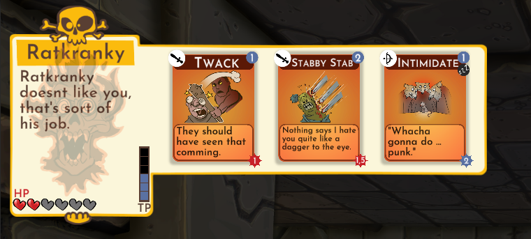
We have reworked the Monster UI. We are adding a softer edge to things but continue to maintain a hand drawn edge to most of the items.
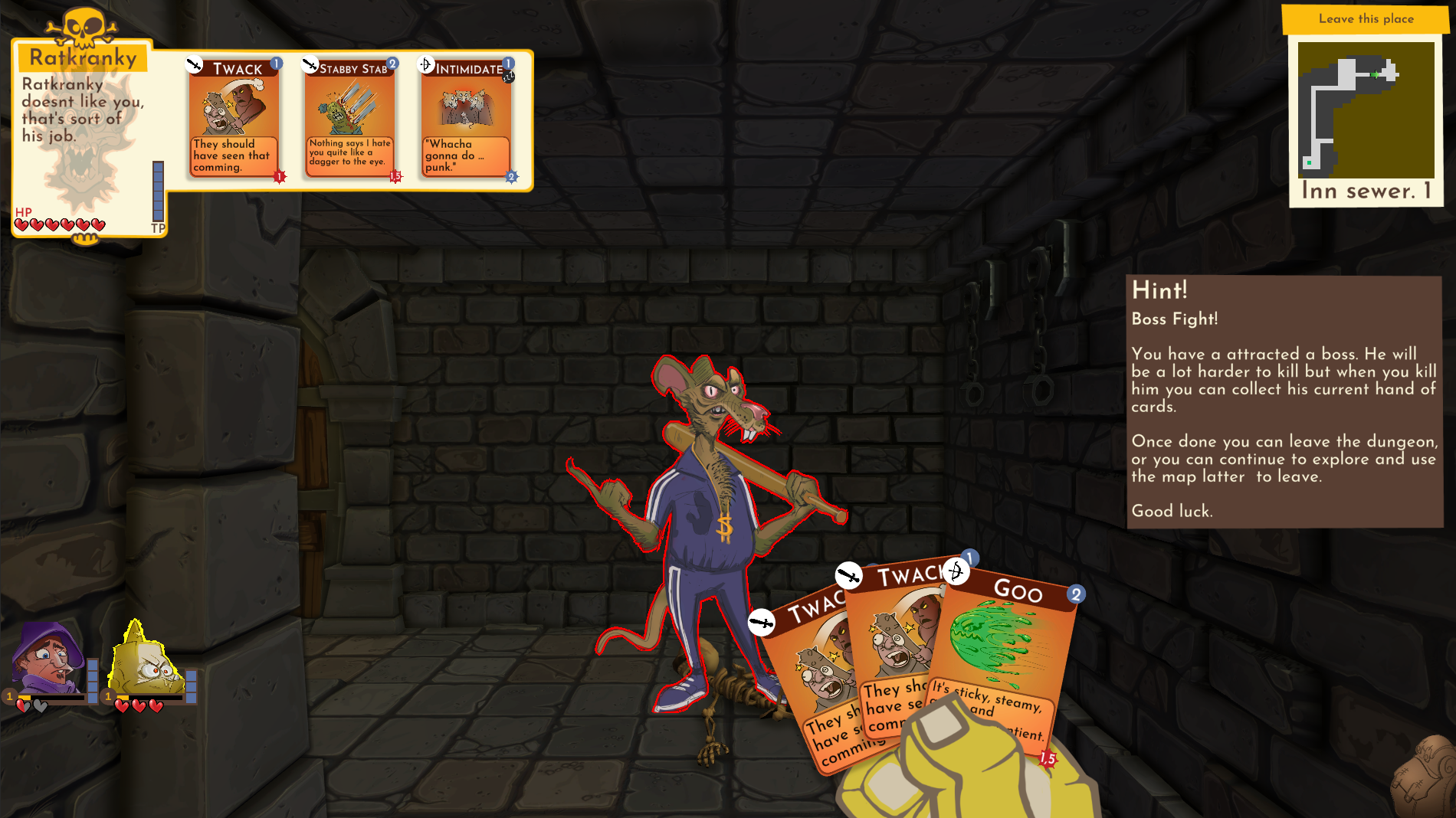
Monster UI in game

Monster UI close up

Hands?
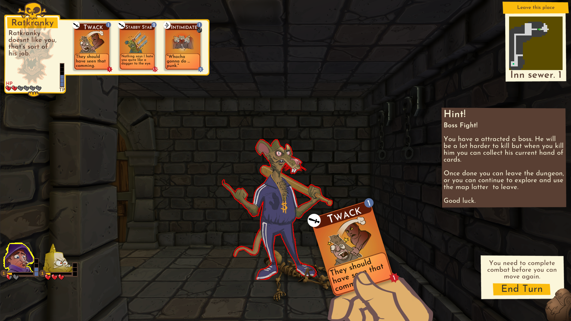
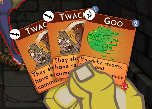
As can be seen from the above image there are also a new hands in the game. So I guess that makes this a FPCG or something like that. One of the issues we are working on improving is bringing the card game more and more into the dungeon. Moving the cards into a First Person style hand contributes to that a lot. As a bonus we also have a unique hand per character additionally bringing their personalities into the game more. We have other steps planned that should bring the card and dungeon games closer and closer together.
These hands have been animated (#dontletyourcodersanimate-ever). The animations may get reworked later but for now they help a lot bringing the game to life.
Hands in screen

Close up of Twinkie Mages Hand

Get Dumbest Dungeon
Dumbest Dungeon
A dungeon crawling card battler with a sense of humor where game balance should be.
| Status | Released |
| Author | Inkus Games |
| Genre | Role Playing, Card Game |
| Tags | Comedy, Creepy, Cute, Dungeon Crawler, Funny, linux, macos |
| Languages | English |
More posts
- Considering Tactics rather than First PersonFeb 20, 2024
- Card GFX DesignJun 04, 2022
- Building Better DungeonsMay 21, 2022
- Linux and Mac builds.May 01, 2022
- Jam Version Fixes and Polish completed.Apr 30, 2022
- Week 2Apr 23, 2022
- Day 7 (last day)Apr 15, 2022
- Day 6 of the JamApr 14, 2022
- Day 5 of the JamApr 13, 2022

Leave a comment
Log in with itch.io to leave a comment.