Card GFX Design
Revamped Card Design So the old card design was a product of sleepless jam work. More effort was required to focus on the communication of the card details.
The new design tries to achieve the following goals.
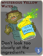
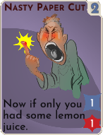
- Communicate the type of card at a glance.
- Allow the images to take up as much space as possible.
- Maintain a real world card shape so they feel like real cards.
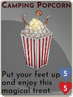
- Communicate the cost and effects easily.
- Make sure cards are readable when in the hand.
- Look cool.
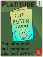
Assist Card Type So to elaborate we have added one new type of card Assist. This has been used for all healing and TP transfer cards. The list of types in the game now are below.
- Basic Combat
- Advance Combat
- Blocking (Defense)
- Magic
- Range
- Backpack (Utility, one use cards)
- Assist
- Conjuring (TBD)
- Mischief (TBD)
To communicate the type’s quickly we have gone with a unique color per type. Below are a few cards as examples.
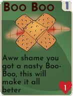

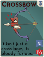
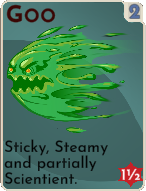
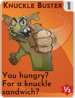
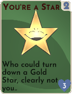
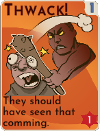
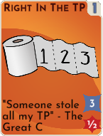
They come together to look like this in the game.
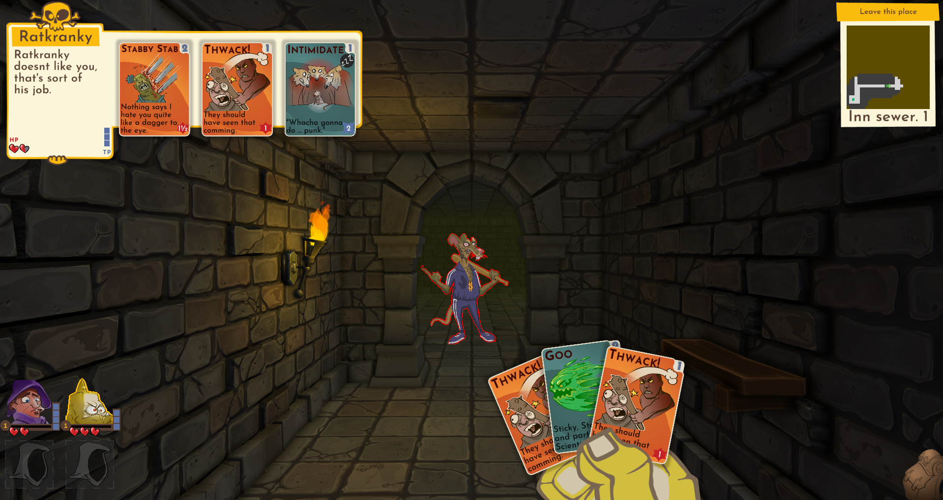
There are some additional minor tweaks to the UI adding the empty slots.
What we need to do next on the cards
We need to show how many or each time you have in your backpack (the utility cards). Also the shapes on the bottom right that indicate damage and healing sometimes bleed into the card. An outline or shadow on them may help. Lastly there are some times the text is too close to the edge and needs to be adjusted slightly. But for the most part we are happy with these designs.
Get Dumbest Dungeon
Dumbest Dungeon
A dungeon crawling card battler with a sense of humor where game balance should be.
| Status | Released |
| Author | Inkus Games |
| Genre | Role Playing, Card Game |
| Tags | Comedy, Creepy, Cute, Dungeon Crawler, Funny, linux, macos |
| Languages | English |
More posts
- Considering Tactics rather than First PersonFeb 20, 2024
- UI ProgressMay 28, 2022
- Building Better DungeonsMay 21, 2022
- Linux and Mac builds.May 01, 2022
- Jam Version Fixes and Polish completed.Apr 30, 2022
- Week 2Apr 23, 2022
- Day 7 (last day)Apr 15, 2022
- Day 6 of the JamApr 14, 2022
- Day 5 of the JamApr 13, 2022

Leave a comment
Log in with itch.io to leave a comment.